-
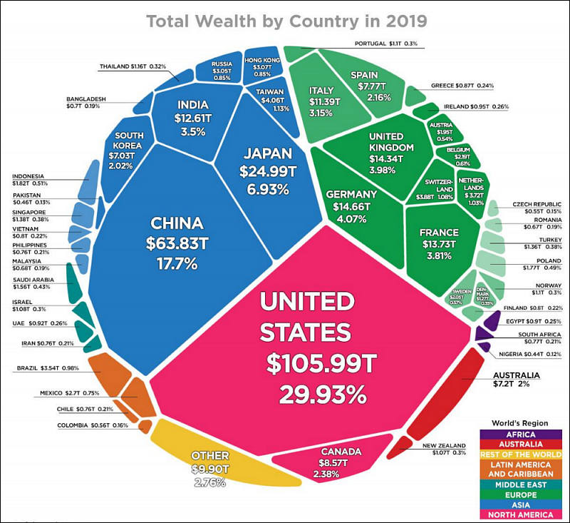
Some of the size relations between areas are kind of suprising to me. For example, the size of Spain wealth with Germany (similar), Brazil (a lot bigger) or Arabia Saudi. I suppose that this chart is about de amount of wealth of multinational companies, not the common people's savings or so. On the other hand, the color code on the world regions that encompass nations is significant.
-
How much of this is abstract or speculative wealth?
-
The researchers at Credit Suisse define wealth, or “net worth,” as the sum total of all financial assets minus any debts. One can argue with the methodology, especially as it relates to the value of intangible assets geography or cultural sites. But this is similar to a balance sheet that a household or business might create, except it’s for an entire country. We grouped each one by continent, letting you quickly compare the total net worth of different countries around the world.
https://howmuch.net/articles/distribution-worlds-wealth-2019
Howdy, Stranger!
It looks like you're new here. If you want to get involved, click one of these buttons!
Categories
- Topics List23,993
- Blog5,725
- General and News1,354
- Hacks and Patches1,153
- ↳ Top Settings33
- ↳ Beginners256
- ↳ Archives402
- ↳ Hacks News and Development56
- Cameras2,368
- ↳ Panasonic995
- ↳ Canon118
- ↳ Sony156
- ↳ Nikon96
- ↳ Pentax and Samsung70
- ↳ Olympus and Fujifilm102
- ↳ Compacts and Camcorders300
- ↳ Smartphones for video97
- ↳ Pro Video Cameras191
- ↳ BlackMagic and other raw cameras116
- Skill1,960
- ↳ Business and distribution66
- ↳ Preparation, scripts and legal38
- ↳ Art149
- ↳ Import, Convert, Exporting291
- ↳ Editors191
- ↳ Effects and stunts115
- ↳ Color grading197
- ↳ Sound and Music280
- ↳ Lighting96
- ↳ Software and storage tips266
- Gear5,420
- ↳ Filters, Adapters, Matte boxes344
- ↳ Lenses1,582
- ↳ Follow focus and gears93
- ↳ Sound499
- ↳ Lighting gear314
- ↳ Camera movement230
- ↳ Gimbals and copters302
- ↳ Rigs and related stuff273
- ↳ Power solutions83
- ↳ Monitors and viewfinders340
- ↳ Tripods and fluid heads139
- ↳ Storage286
- ↳ Computers and studio gear560
- ↳ VR and 3D248
- Showcase1,859
- Marketplace2,834
- Offtopic1,320


