It allows to keep PV going, with more focus towards AI, but keeping be one of the few truly independent places.
-
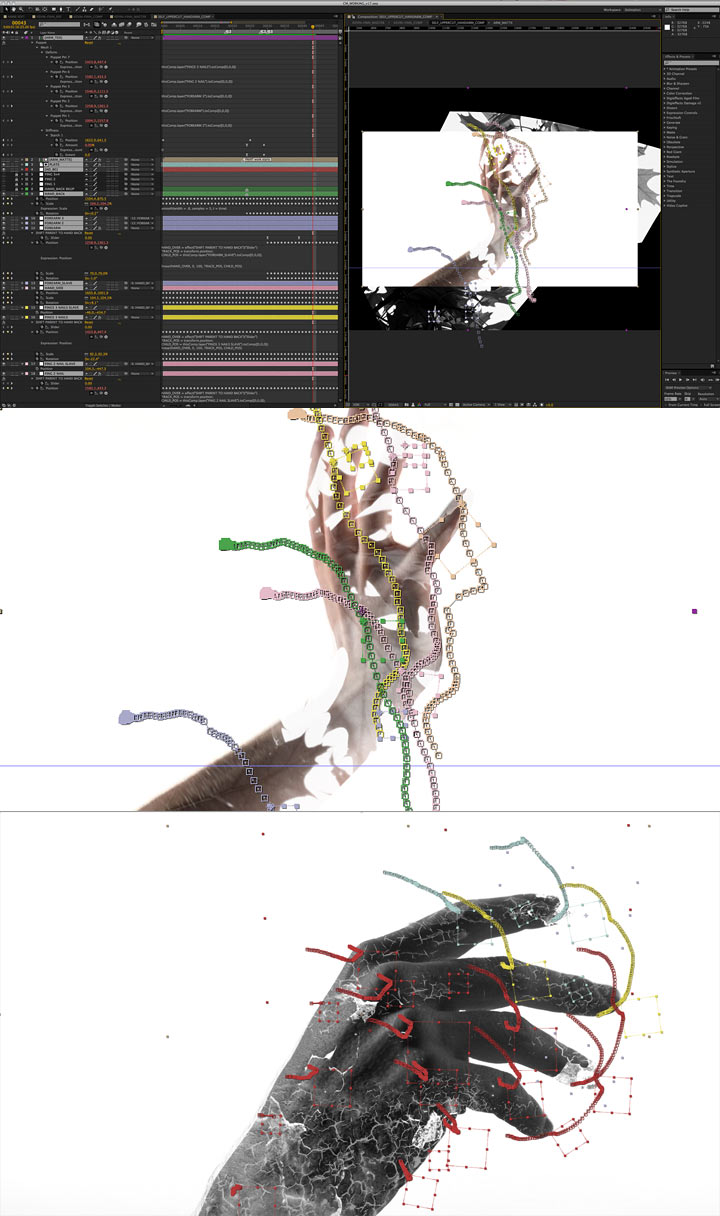
Thanks, that render script is working now. It seems to me a little bit faster. I am not sure because I did not compare by hit the render in AE or run the script . Also thanks for this link: http://cgi.tutsplus.com/series/welcome-to-after-effects--ae-28707 help me a lots.
-
@tinbeo cheers mate =)
And super interesting und complex BTS; article at watchthetitles
Looping animations in After Effects from RiverCityGraphix
Cycle:
loopOut()
Ping-Pong:
loopOut(“pingpong”)
Cool Morphing Shape Paths from Mount MoGraph
Andrew Kramer did it (whatever that means), his keynote at After Effects World Conference
with some quite interesting stuff/advises buried under usual BS - SPOILER touching ending :)
Finally - @VK don't get mad bro, I had too much stuff accumulated for the thread =)
intro from Toshiaki Toyoda's Nain Souruzu aka 9 Souls (funny flick with soul). Sorry for quality, coudn't find any better.
PUMP UP the VOLUME!!!
-
Total com-puto-geoparafernalism... but within the highest level as PV's standars require =)
That's some video projection I, for once, would enjoy... more after some spifipuffin ouch ouuuch ouchhh
H OM E OMOR PH ISM
Dome A/V Performance in New Mexico
Direction&Animation: Ouchhh
Director:Ferdi Alici
Concept Development: Eylul Duranagac, Ferdi Alici, Selay Karasu
Project Manager: Selay Karasu
Lead 3d : Bahadir Dagdelen
A/V Artists: Bahadır Dagdelen, Eylul Duranagac, Ferdi Alici, Selay Karasu
Documentation: Selay Karasu
Sound Design: Ali Can Okan, Hakan Ozkan, Mehmet Unal
Sound Samples: Ryoji Ikeda-Data.Matrix
A homeomorphism, also called a continuous transformation, is an equivalence relation and
one-to-one correspondence between points in two geometric figures or topological spaces
that is continuous in both directions.
Many forms observed in nature can be related to geometry. In accordance with classical geometry,
the shapes that found in nature are consisting of lines and planes, circles and spheres,
triangles and cones. These shapes actually are a powerful abstraction of reality, so we need primitive objects to give a form and understand the complex structure that exists in nature.
Our starting point was topography and primitive object’s pertinent points of overlap. The inspiration
comes from the extreme diversity of New Mexico’s landforms (which is divided into four regions; Great Plains, Rocky Mountains, Colorado Plateau, Basin and Range Province), general changes of topography and homeomorphism.
more details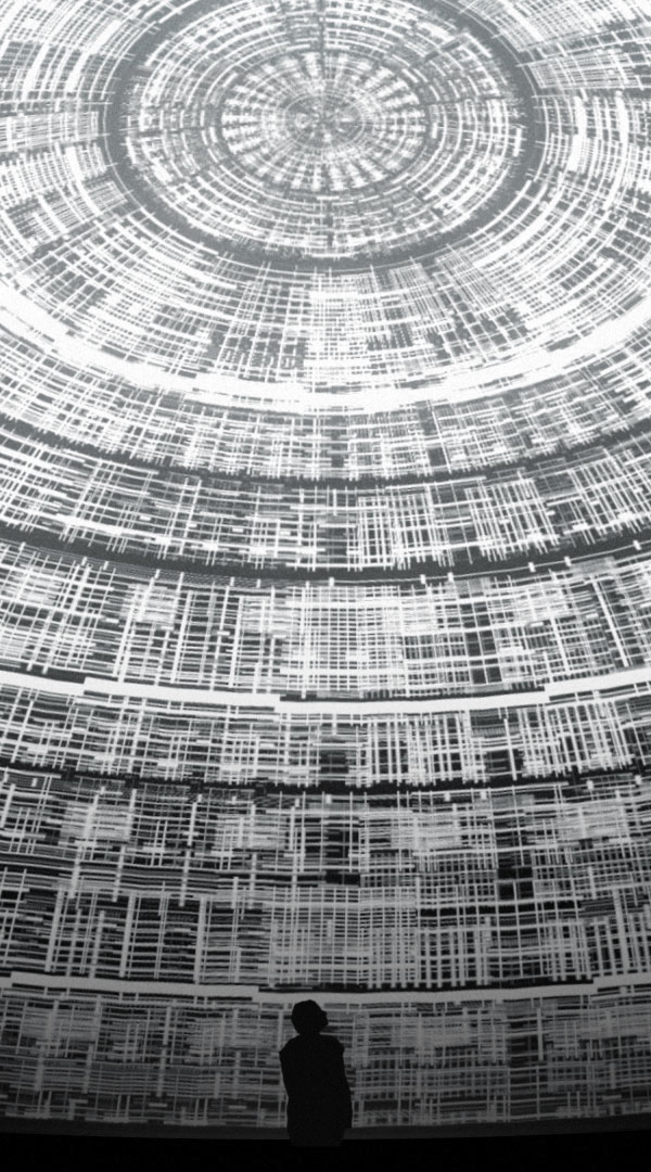
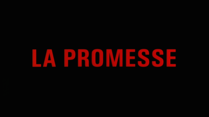
Needed some blOOd here, from Dardenne bros - mandatory belgium filmmakers with some milestones (Rosetta, L'infant, The Silence of Lorna, etc.). Despite a phoenix Cotillard and the interesting subject didn't get thrilled with their last delivery
But for effectiveness there's no need for super complicated entanglements; 5 days from Brad Anderson's Session 9, a promising film that sadly looses itself and ends up butchering a solid cast and its great little treasures (dp, visual and sound design and ubber uncanny location - echoes of the shinning); worth a watch nevertheless. Anderson would make up with Fringe and Transsiberian (great action packed flick + mr PVH {power-vegan-harrelson})... the recent stuff I haven't and probably not going to check +)

-
Sat patat or thirst first = Howdy :-)
Experimenting within some very disconEXEd and discombobulated state of mind, so forgive the unseriosness of the apologies.
In this... "thing" it's good to be aware that the squares are "real" pixels shot with a camera, then cropped and augmented; the subject is a ferrari... seriously, that might be super important. The typing is also in realtime and not an animation.
SOUNDTRACK
Retweaked stream from Soma's SF 10-33 - ambient music mixed with San Francisco public safety radioThis other "thing" is the result of superficially playing around with some Motion Works experiments (link below) and silly ideas inside AE; dust and particles generation, blurs and displacement maps and simple text (non 2.5D nor 3D). Despite the background was layered, didn't rig a camera for better, more realistic zoom in effect... maybe lazy factor, maybe felt good about keeping a bidimensional confinement, maybe sat the bar for tech enough proof of concept, without concept, without bar just time wasted · cough cough, coffin & mind =)
SOUNDTRACK
Tweaked and remixed extract from Caníbal OST
He says "To kill... I kill them (feminine) and I eat them"
LINKS
Check MotionWorks cool experiments' concept - http://motionworks.net/experiments/
SomaFM - http://somafm.com/listen/ - they also provide a really nice free app for tunning their radios
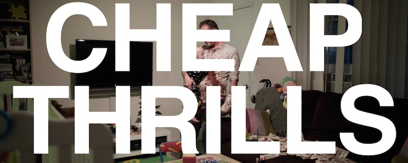
Leaving that BS behind, let's see some letritas:Watch out, big SPOILERS ahead for Cheap Thrills flick!!!
Classy type from Caníbal, great flick (wonderful script and palette), with some flaws; I'll be posting more diarrhea about it soon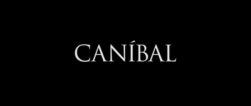
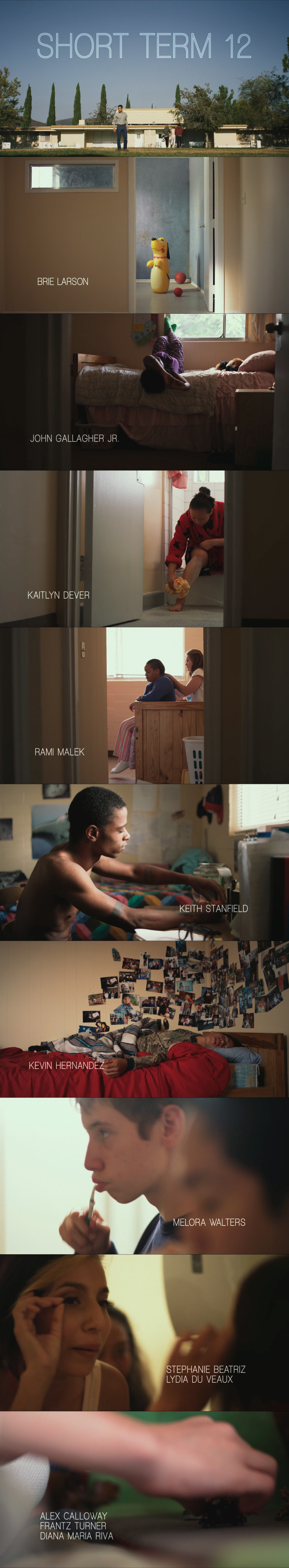
Very nice intro titles sequence from Short Term 12, very good flick (script) with some holes, great deliver specially by the kids
The Spectacular Now title

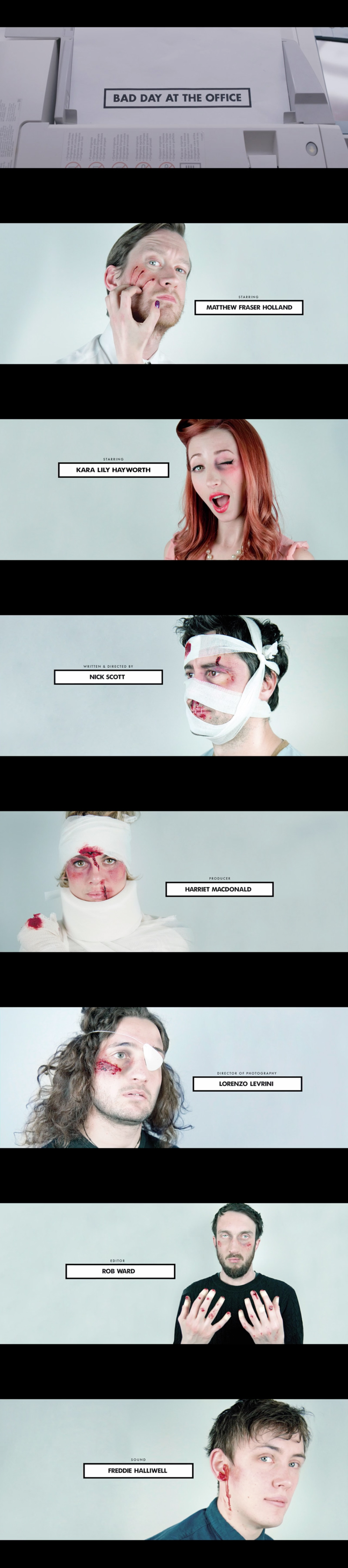
Cool credits from Bad Day at the Office short
Kerning properly done in Cheap Thrills' intro simple titles - want to know how good are your PC kerning skills?
check them out with this silly game Kerning Game, I scored 91, je je dumb as I am

And awesome final postcard +)
We shall end as we started with canniBALLS; this time EAT, which despite an appealing poster is a shitty flick, better watch Starry Eyes, Blue Ruin, Exhumed or Pieces of Talent for some interesting un-perfect "indie" horror. Nevertheless I very much liked the intro sequence and titles, vaguely reminded me of a very nice music/dancing sequence inside a shop from an 80's classic zombie flick (cannot recall the name); bad quality video, but we can live with that, can't we?
A good weekend for y'all, RTSU2 -
Today's detour seems to get us a bit into design world/concept
making - improoving a showreel // some very nice tips and graphic design with Carey Smith from Division05
the dude's starts the dough
10 Free After Effects Templates: Typography
still on conceptualising a logo
A bit of Hitchcok-Fincher intro study
Spring Breakers, what to say??? Very strange film, not shocking at all, very unsexy people, very very sexy colours and wise use of them; somehow enlightened and somehow very alienated and alienating, voided... talking of which it reminded me of Gaspar Noé's Enter the Void from 2009.
Still one of best compendiums on colour mix and saturation I've ever seen (green, yellow, red - pink, blue, orange - and so on) if only 'cause of that totally worth the exercise class.
BTW, James Franco fuck you!!!

Enter the Void intro Titles, you can get all fancy and clean but not more cool than this :P
Finally - as we got all wacko lsd and shit - something that remotely remind me of Douglas Trumbull's (up-down FXs for) SO 2001
-
Hi there... {and the echo ended the function}
Let's throw some stufff in the stone soup's pot, shall we?First of all I retroactively want to thank Susana Sevilla =)
Then, The Edge film and titles, classy in best possible way
I know, I know, this guy's all over the internet and furthermore this "tutorial" has nothing to do with titles; but I thought {puf} and felt {ahhh} that this is something worth sharing; father love and absolute tame of AE +)
This is a rather unusual (and interesting) article about a font, ejem I mean a lost type
http://www.bbc.com/news/magazine-31534032

The Doves Press was one of a number of private printing presses operating at the start of the 20th Century.
The press was established by TJ Cobden-Sanderson, with Emery Walker joining later as partner. The pair commissioned Edward Prince to punch cut the single-sized 16 pt text that was used in all the Doves Press publications.
Walker had previously worked with William Morris but the spartan aesthetic of the Doves Press publications were in contrast to the ornately illustrated books of Morris. Paradise Lost and a five-volume Bible were among the publications which used a 'type for today'.
The only decoration in the books were capitals created by Edward Johnston and Graily Hewitt. Johnston went on to design the typeface that is still used on the London Underground.
'Obsession'Designer Robert Green first encountered the Doves Press type at art college but it was in 2010 that he began an interest which, he says, became an 'obsession'.
There were 40 books and 96 pieces of Doves Press ephemera printed and Mr Green tried to obtain as many examples as he could in order to reproduce the text in a digital form.
Hours and hours of study and countless reiterations of the letter saw him create his first version of the Doves Type in 2013. But Mr Green thought there was room for improvement and he continued to refine it.
A prolonged dispute began between Cobden-Sanderson and Walker began in 1906 and Cobden-Sanderson attempted to end the partnership.
After the partnership had been formally dissolved in 1909, Walker was promised a 'fount of type' for his own use but Cobden-Sanderson was worried that the type could be sold and used on a mechanised press.
'Bequeathed to the Thames'In 1913, unknown to Walker, Cobden-Sanderson threw the Press punches and matrices into the River Thames. He waited three years before he began to dispose of the type night after night at the same spot from a bridge over the Thames.
It was only in 1917 when Cobden-Sanderson announced he had 'bequeathed' the type to the river that the truth began to emerge.
Cobden-Sanderson died in 1922, his widow Anne was then sued by Walker and had to pay £700 for the loss of the type.
After working on a revised digital facsimile Robert Green decided that he would try and find some of the original metal type. Using the sources available, including Cobden-Sanderson's published journals, Mr Green worked out where he thought the type was thrown from the bridge into the Thames.
At low tide, and with a mudlarkers licence, he scoured the Thames foreshore and found three pieces of the original type.
Due to the dangerous nature of the Thames currents and tides a team of professional divers from the Port of London Authority then spent two days looking for more type and a total of 150 pieces were recovered.
Concrete which was used to make bridge repairs has covered the remainder of the type.
Respect for the typeMr Green has decided to loan half of the type he had found to the Emery Walker Trust.
The type will be on display at Walker's house, which is preserved as it was in his lifetime, for the public to view. Mr Green says that he is sympathetic with Cobden-Sanderson but Walker 'did get messed about' and it is a 'nice end to the story'.
The typeface used for the text in this video is Doves Type which is now available commercially. Mr Green hopes people 'respect' the type and use it for print.
BBC News went to meet Robert Green and hear more about the origins of his obsession with reclaiming the lost type from its watery resting place.
Video Journalist: Tom Beal Emery Walker still courtesy of the Emery Walker Trust. Emery Walker's house at No 7 Hammersmith Terrace is open from March until June, prior to refurbishment. Cobden-Sanderson portrait by William RothensteinExtra (photo and info) resources by typespec:
http://www.typespec.co.uk/doves-type/
http://www.typespec.co.uk/recovering-the-doves-type/
Talking bout types, 10 Free After Effects Typographyc Templates gathered by the PremiumBeat guys
S P O I L E R S
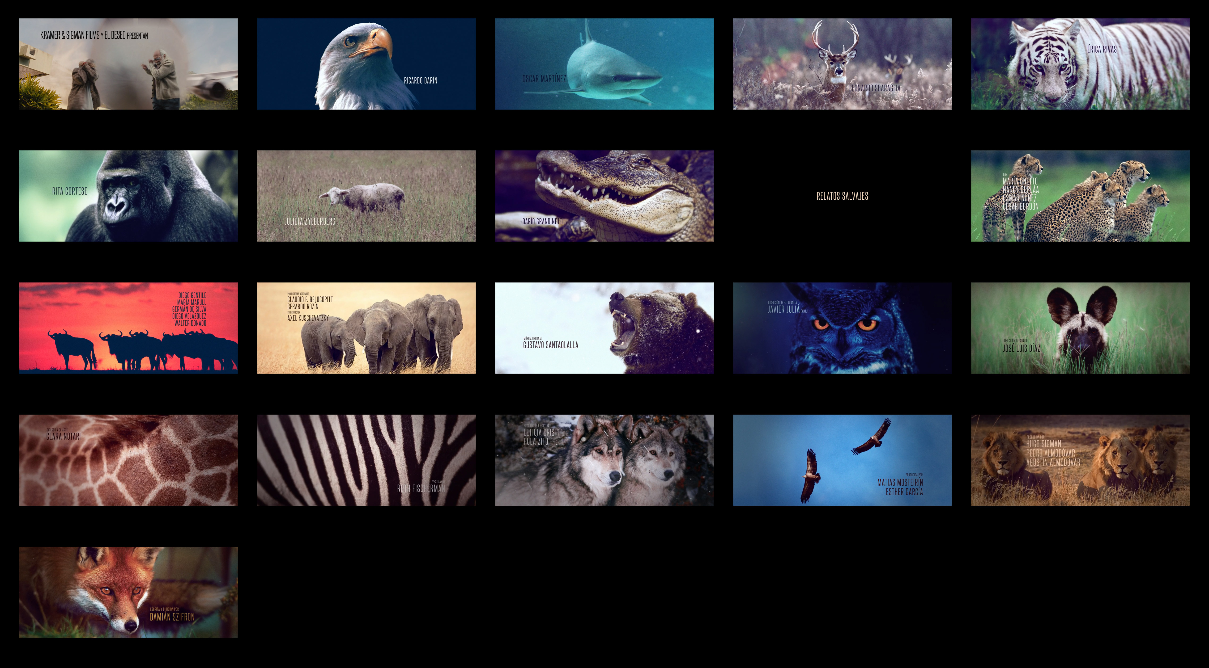
The funny and beautiful nature themed intro titles from @VK 's safe list Relatos Salvajes - Vitaliy I know the image is huge but also you should know my scissors are rusty :P
Okay, that's enough for 1 blow ow ow ow, neXt time La Isla Mínima breathtaking and fresh aerial intro titles =)
A relapsed pill just for the pips who really really cannot sleep: + 1hr of Saul Bass spanning 40 years of career, BIG thank you to FlaneurSolitaire's great work... and taste :P
ba-bye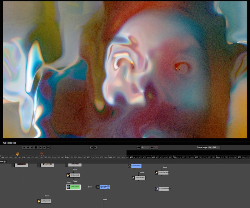
 RelSal_intro.jpg5120 x 2831 - 2M
 ghost-zombie-vegan-hater.jpg800 x 666 - 129K


Howdy, Stranger!
It looks like you're new here. If you want to get involved, click one of these buttons!
Categories
- Topics List23,964
- Blog5,723
- General and News1,342
- Hacks and Patches1,151
- ↳ Top Settings33
- ↳ Beginners254
- ↳ Archives402
- ↳ Hacks News and Development56
- Cameras2,361
- ↳ Panasonic990
- ↳ Canon118
- ↳ Sony154
- ↳ Nikon96
- ↳ Pentax and Samsung70
- ↳ Olympus and Fujifilm99
- ↳ Compacts and Camcorders299
- ↳ Smartphones for video97
- ↳ Pro Video Cameras191
- ↳ BlackMagic and other raw cameras121
- Skill1,961
- ↳ Business and distribution66
- ↳ Preparation, scripts and legal38
- ↳ Art149
- ↳ Import, Convert, Exporting291
- ↳ Editors191
- ↳ Effects and stunts115
- ↳ Color grading197
- ↳ Sound and Music280
- ↳ Lighting96
- ↳ Software and storage tips267
- Gear5,414
- ↳ Filters, Adapters, Matte boxes344
- ↳ Lenses1,579
- ↳ Follow focus and gears93
- ↳ Sound498
- ↳ Lighting gear314
- ↳ Camera movement230
- ↳ Gimbals and copters302
- ↳ Rigs and related stuff272
- ↳ Power solutions83
- ↳ Monitors and viewfinders339
- ↳ Tripods and fluid heads139
- ↳ Storage286
- ↳ Computers and studio gear560
- ↳ VR and 3D248
- Showcase1,859
- Marketplace2,834
- Offtopic1,319


