It allows to keep PV going, with more focus towards AI, but keeping be one of the few truly independent places.
-
For a good while now, I've been shooting everything as flat as possible. This was seemingly to give more headroom in post especially with the advent of DaVinci being free and all.
I've recently shot a short trying to mash all of the detail into a very narrow dynamic range to extrapolate it later in post which has worked for the look, but for the finer things it's kinda fallen apart.
I feel like shooting ultra flat and compressing the dynamic range yields less artifacting but adds a more video like aesthetic after graded.
Is it, in all of your minds, feasible to create more of the look in camera with high contrast and risk some artifacting or is it better for you to shoot flat and correct later, for a film aesthetic?
I'm on the fence, I want to hear what you think.
-
@artiswar Interesting question that I'm also interested in hearing the answer/opinions on. What did you mean when saying "but for the finer things it's kinda fallen apart"? I saw some of the frame grabs you posted and I thought they looked great. I was viewing on 15" MacBook Pro (1440x900 Res), so maybe you're viewing on larger ~60" HDTV screen, or on a large screen in theater. Do you mean details in close-up shots?
I would guess @shian has knowledge of this issue.
@shian Any opinion or preference on what's the best way to shoot and edit in terms of this issue?
-
-
I thought Gh2's film mode's "Contrast" setting is nothing to do with dynamic range. Doesn't it affect only color contrast?
-
@stonebat - I should have been more clear, I meant contrast in lighting. Lighting a 2:1 or a 4:1 ratio and crushing in post to something darker.
-
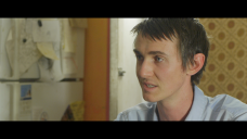
I might have just looked at it all too long. Here's the crushing I'm talking about. Lit for a 4:1 ratio, crushed to about 6:1.
 Screen Shot 2012-10-21 at 8.12.53 PM.png2560 x 1440 - 3M
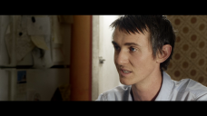 Screen Shot 2012-10-21 at 8.12.09 PM.png2560 x 1440 - 3M
 -
Oh I see. I don't like the white door(???) background where the face overlaps. When S curve is applied, the door looks too bright.
-
@stonebat - Absolutely. Super rushed schedule so we didn't have time to flag it off on the side. I can live with it.
-
@artiswar That's a situation where HSL qualifiers in DaVinci would allow you to quickly isolate the white of the door and bring the exposure down to make it fade into the background instead of having it compete with the foreground elements.
-
Also the white balance adjustment. The door looks too white. The original green tint looks better to my eyes. Just my 2 cents. I'm not trying to be nitpicking :)
-
About 2:1 or 4:1 then pushing to 6:1, I think it would be more difficult to record 6:1 ratio in the first place. It would increase the chance to overblown the highlight details or increase noise in dark...
-
No idea how this video is related to this topic... but I was looking at this video while reading this post....
-
I think we had few discussion of this already, check @cbrandin posts. As I remember he covered this topic.
-
@Philldaagony - I began to do this, the door began looking too muted.
-
This is where you learn that white and black objects, doors, walls etc, all require forethought and planning. Every time I see one I immediately start planing how to get it properly exposed within the framework of the rest of the shot.
I'll start covering this in the advanced courses.
Just for the record, I hate white walls and doors... and pure black objects to a lesser degree.
-
I feel like shooting ultra flat and compressing the dynamic range yields less artifacting but adds a more video like aesthetic after graded.
"Shooting flat" is based on the assumption that the bit-depth of the color components in each pixel exceeds the overall dynamic range of the camera. With a RAW or 10-bit 4:2:2 encoder, this can be the case, particularly at high ISO levels. With an 8-bit 4:2:0 AVCHD encoder it's debatable.
In general, there is no good reason to avoid making use of the highlight region of the image sensor's dynamic range - that's where the best encoding precision is found, as long as the highlights remain unsaturated. The near-black region of the sensor, however, is encoded very coarsely and is best avoided by either raising the camera's pedestal setting, or adding fill lights to lift the illumination of shadow details into gray. In post with a 32-bit NLE, you can then lower the pedestal and/or video gain until the shadows are dark enough, which will give you more headroom to grade the highlights.
-
@artiswar Yea, that's always my worry. Shian is right, always pay attention to white walls, doors etc while shooting. But, even then not everything can or will be caught, and sometimes the fixes in post don't work, especially with AVCHD codecs.
-
I still don't get this whole shoot flat thing. It's not going to instantly make your scene look professional. Shooting flat for dynamic range has nothing to do with properly lighting a scene. The frame grabs of the dude in the kitchen haven't been lit very well and the background wasn't chosen very well either and that is what causes the hardship in grading. Always, always light how you want it to look and never rely on post grading as a crutch. That goes for any camera, any scene. Hollywood spends huge amounts of money on lighting and set design to make movies look good. In fact, they spend a lot more money on those things than they spend on cameras... Just because it looks normal on camera doesn't mean that they didn't spend days and lots of money to make it look that way! Do it in the camera and you'll never run into problems with grading.
-
This guy in the picture is also keyed from camera side -- this is almost always a bad idea. I just shot a short where the director wanted a "Desperate Housewives" look. And we shot at his house, so I had to scout the house, take some pictures, and spend a bit of time figuring out how to play off the practical sources, and then control the light I was bringing in to get the look he wanted while getting a strong back key. And then talk him into ordering the right gear to control the light [CTO and ND Gel rolls, scrims, screens, silks, flags, cutters, lots of c-stands, and sand bags] and allow me to do the things I needed to do to get a backside key. The director didn't understand why I needed all this stuff until he saw it implemented, and the effect. And then he was happy he spent the money. Otherwise his white walls and the sunlight outside would have killed us. Instead, the footage came out perfect, and will grade like a champ.
-
Also. It's not just the white door. It's the stark contrast and DR between the white door and everything else in the shot. If the whole room fits within a pretty narrow DR, not such a big deal.
I really need to get the pure zone system tutorial done soon. It will clear a lot of this up.
-
@shian Truer words have never been spoken. If you spend the time and money lighting correctly then everything else falls into place.
-
@svart and @shian - Appreciate the critique. We were working very rushed and really limited on time. No budget and the house we were supposed to use (that I had lit to a t) bailed. Relit this with DIY Lights (that lit this whole short) in about 15 and the cameras were set very haphazardly. Prime example of poorly defined crew roles on a no budget short. @shian - I totally spaced not keying from camera side. Thinking about it now, it would've worked much better to flip the fill and key.
-
-
At this point, I'm kind of kicking myself for not lighting more too eye. Learning experience though!
-
I tend to find that in a situation like this, you can possibly do away with the back light, because the background is light/bright enough that the person "stands out" from the background pretty well. I also notice a lot of flare around the head, which is likely because the back light is too bright for the scene. I would have used both lights up front or used a single light with a bounce card/bead board for fill. Bead board and a key light could make a very good setup with minimal budget and gear. I don't necessarily agree that keying from camera side is bad, but the effect is that the other side of the face is too dark and creates more contrast than is good for this situation. It's all in the situation though. I'd actually suggest studying how to light with a single light and then move to a light with bounces, then two lights, etc. Lots of folks can buy a kit with a bunch of lights and then set them up like they see in the DIY lighting guides but sometimes going back to basics can really drive home the understanding of what we are trying to do. I'm not a guru by any stretch, I think @Shian knows his shit pretty well so I'd listen to him more than me, but don't be afraid to try new stuff out either. There is a basic amount of knowledge that you need, but there is always room for innovation.
-
I'm hoping Gh3 can help it by capturing a movie frame as jpeg and transferring to a tablet. Then use a tablet app to do some quick color grading. It would take a few mins. This wouldn't tell how to do lighting properly, but it would show something has gone wrong. Is there such tablet app that can do such thing... plus histogram, waveform, and scope?


Howdy, Stranger!
It looks like you're new here. If you want to get involved, click one of these buttons!
Categories
- Topics List24,098
- Blog5,725
- General and News1,403
- Hacks and Patches1,153
- ↳ Top Settings33
- ↳ Beginners256
- ↳ Archives402
- ↳ Hacks News and Development56
- Cameras2,401
- ↳ Panasonic995
- ↳ Canon118
- ↳ Sony156
- ↳ Nikon96
- ↳ Pentax and Samsung70
- ↳ Olympus and Fujifilm102
- ↳ Compacts and Camcorders300
- ↳ Smartphones for video97
- ↳ Pro Video Cameras191
- ↳ BlackMagic and other raw cameras149
- Skill1,960
- ↳ Business and distribution66
- ↳ Preparation, scripts and legal38
- ↳ Art149
- ↳ Import, Convert, Exporting291
- ↳ Editors191
- ↳ Effects and stunts115
- ↳ Color grading197
- ↳ Sound and Music280
- ↳ Lighting96
- ↳ Software and storage tips266
- Gear5,420
- ↳ Filters, Adapters, Matte boxes344
- ↳ Lenses1,582
- ↳ Follow focus and gears93
- ↳ Sound499
- ↳ Lighting gear314
- ↳ Camera movement230
- ↳ Gimbals and copters302
- ↳ Rigs and related stuff273
- ↳ Power solutions83
- ↳ Monitors and viewfinders340
- ↳ Tripods and fluid heads139
- ↳ Storage286
- ↳ Computers and studio gear560
- ↳ VR and 3D248
- Showcase1,859
- Marketplace2,834
- Offtopic1,343


